|
HP OpenVMS Systems Documentation |
|
DECwindows Companion to the OSF/Motif Style Guide
1.4.1 Question Dialog BoxUse a question dialog box any time that you ask a question, for example, when reporting an error or giving a warning and then asking a question, as shown in Figure 1-19. Make the question message box application modal. The question dialog box comes with a question symbol. You provide a title, a question, and properly labeled push buttons, as shown in Figure 1-19. Figure 1-19 Examples of Question Dialog Boxes 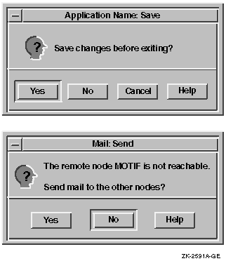
Make the default the most likely choice; do not make the default push button a destructive action. Arrange the buttons in one of the following combinations:
1.4.2 Error Dialog BoxUse an error message box when users do something to create the error, for example, when a user tries to write a file to a directory that does not exist. If the message box tells users they have made an error and then asks a question, use a question dialog box. If your application makes an error that is not due to user interaction, use an information dialog box. Make the error dialog box application modal. The error dialog box comes with an error symbol. You provide a title, a statement describing the error, and properly labeled push buttons, as shown in Figure 1-20. Make the default the most likely choice; do not make the default push button a destructive action. Arrange the buttons in one of the following combinations:
Figure 1-20 Error Dialog Box 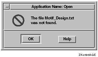
A Cancel button is included in the possible button combinations because
Motif allows cancel buttons in error dialog boxes. Use a Cancel push
button only if it does something different from the OK push button.
Use an information dialog box when users need information that is not an error, or when an error occurs that is not the result of a user action. The information must be a statement. If it is a question, use a question dialog box. Make the information dialog box modeless. The information dialog box comes with an information symbol. You provide a title, a statement, and properly labeled push buttons, as shown in Figure 1-21. Make the default the most likely choice; do not make the default push button a destructive action. Arrange the buttons in one of the following combinations:
Figure 1-21 Information Dialog Box 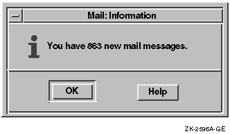
1.4.4 Warning Dialog BoxUse a warning dialog box to alert users to potential problems an action might cause. Make it application modal. The warning dialog box comes with a warning symbol. You provide a title, a message, and properly labeled push buttons, as shown in Figure 1-22. Make the default the most likely choice; do not make the default push button a destructive action. Arrange the buttons in one of the following combinations:
Notice that Yes and No buttons are included in the possible button combinations. Motif allows questions in warning dialog boxes; in such cases you would use Yes and No push buttons. However, Digital recommends that you always use a question dialog box whenever you use a question. If you follow Digital's recommendation, you will not be using Yes or No push buttons in warning dialog boxes. Figure 1-22 Warning Dialog Box 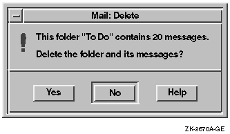
1.4.5 Working Dialog BoxesUse a working dialog box to show work in progress and to give users an opportunity to cancel an operation. Make the working dialog box modeless. The working dialog box comes with a working symbol. You provide a title, a message, and properly labeled push buttons, as shown in Figure 1-23. Make the default the most likely choice; do not make the default push button a destructive action. Arrange the buttons in one of the following combinations:
Figure 1-23 Working Dialog Box 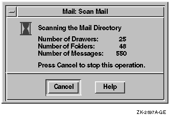
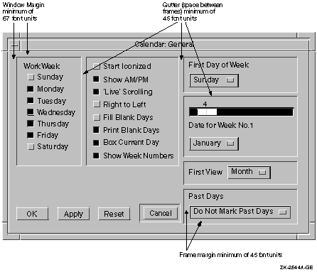
1.5 Creating a Logical and Appealing Layout of ControlsIn addition to making your dialog boxes functional, it is important to organize their components in a way that is visually appealing. A good layout of a dialog box's controls will help users gain the maximum utility from the dialog boxes you create.
To help you organize controls, consider sketching each dialog box using
graph paper, or an online drawing tool with a grid, or an interface
design tool (IDT).
To give dialog boxes a perceivable structure, group related choices. Use space or bevels to create a sense of grouping. A bevel is a three-dimensional box (or frame) that you can use to surround a group of choices. For example, in Figure 1-24, the first dialog box uses space to create groupings; the second dialog box uses bevels. Figure 1-24 Group Related Choices Using Space or Bevels 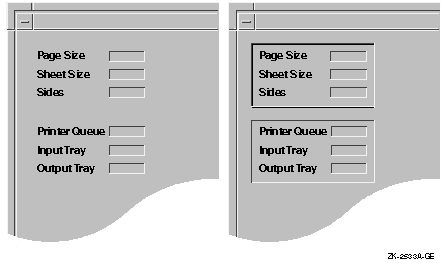
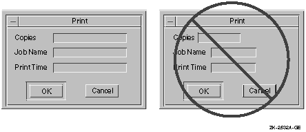
1.5.2 When to Avoid Using Punctuation in Dialog BoxesIf the elements in a dialog box are grouped and indented properly, colons or other punctuation marks between fields are not needed. For example, do not use colons between labels and input fields, as shown in Figure 1-25. Figure 1-25 When to Avoid Punctuation in Dialog Boxes 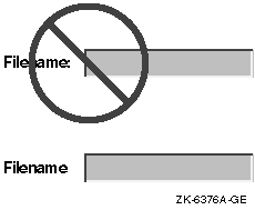
A text field with its border looks sufficiently different from a label; additional punctuation only adds clutter. Note that punctuation is recommended when the text conveys a message. Also, colons can be used in output-only fields for header information. For example, in an editor, the current file name might appear as follows: 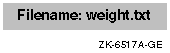
1.5.3 Keep Dialog Boxes SimpleIf the context or use of a dialog box is not apparent from its title, add a phrase or sentence at the top of the box to make its purpose clear. Such text can simplify the remaining contents of the box. Figure 1-26 shows both a poor example and then an effective example of a dialog box for applying colors to the trash window. Figure 1-26 Simplifying Dialog Boxes 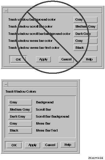
1.5.4 Use Uniform Spacing Within the Dialog BoxWhen you are placing the controls in a dialog box, follow these guidelines to make the spacing uniform:
1.5.5 Align Labels and Text FieldsLabels and text fields need to be aligned both vertically and horizontally. To position labels most effectively vertically, align the labels with the baseline of text in a text-entry field, not with the bottom of the entry field itself. Figure 1-30 shows an effective way to align labels, as well as one that is not effective. Figure 1-30 Align Labels with the Baseline of Text 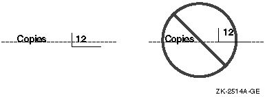
There are two recommended methods for aligning labels and text fields horizontally. One has the labels left justified, as shown in Figure 1-31. Figure 1-31 Left Justified Alignment of Labels and Text Fields 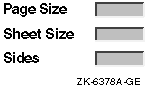
The other has the labels right justified, as shown in Figure 1-32. Figure 1-32 Right Justified Alignment of Labels and Text Fields 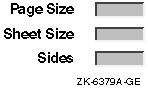
When labels are right justified, the right ends of the labels line up. The order of the fields is the same as the left justified method, but the implementation is different. No matter which style you choose, make sure that you consistently use that style throughout your application and that the text fields for users to enter information are always left justified. The following programming hints are for producing left justified and then right justified labels.
1.5.6 Promote Scanning from Left to Right, Top to Bottom
Organize your controls to promote scanning from left to right, top to
bottom (in left-to-right language environments). Use indentation to
show groupings and relationships in a visible series. Consider the
guidelines in the following sections when you organize controls.
The top left corner of your dialog box is the area that users are drawn to first; use it strategically. Place one of the following controls in that corner:
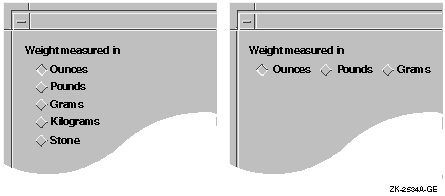
1.5.6.2 Present Related Controls in a Clearly Visible SeriesWhen providing related controls in a series, use a left-justified vertical series or a horizontal series reading left to right, as shown in Figure 1-29. Horizontal series are acceptable for approximately four or fewer items. If the series contains more items, make it vertical. Note that a vertical series is easier to translate because foreign-language text has room to expand. Be careful when you use two or more groups of radio buttons. Radio buttons allow mutually exclusive choices. Therefore, you want to make sure that users understand your grouping. You do not want them to be confused as to whether they can choose only one button from all of the buttons in the dialog box or whether they can choose one from each group. You should consider indenting the radio buttons and toggle buttons so that the groupings become more obvious. Indenting adds more empty space and makes the dialog box appear less cluttered. In general, you should lay out your controls so there is enough white space between them and around the margin to make the display restful for the user's eyes, and to make it obvious where the user should focus attention. Figure 1-29 and Figure 1-33 show groupings of indented radio buttons and toggle buttons. Figure 1-33 Appropriate and Inappropriate Labeling of Radio Buttons 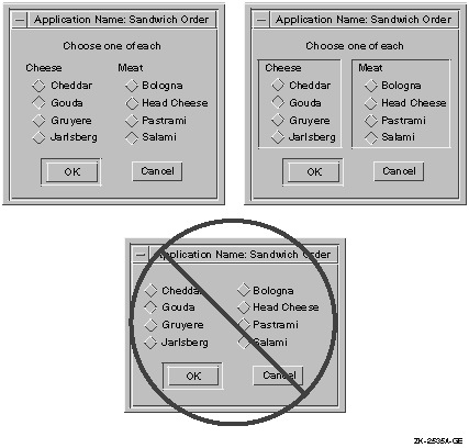
1.5.6.3 Clarify StructureClarify your structure by organizing your controls in one of the following orders:
Notice that the cheeses and meats in Figure 1-33 are listed in alphabetical order. Notice also that the weight measurements in Figure 1-29 are organized for frequency of use in American culture, with the two metric units grouped together. In this particular case, you could alphabetize the choices to get the following order:
The organization still preserves the grouping of metric, English, and
Imperial measurements.
Appropriate defaults allow users to continue working by pressing the Return key (thereby activating the default push button). For example, you can have a dialog box show the most commonly chosen controls already selected so that, in most cases, users can just press Return to get those choices. Figure 1-34 shows a Page Setup dialog box that appears with the most common choices (the defaults) already selected. Users can either click on OK or press Return to accept the defaults. Figure 1-34 Provide Appropriate Defaults 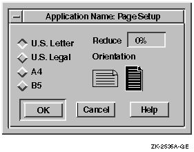
1.5.6.5 Use Option Buttons to Conserve SpaceOption buttons post an option menu. (Do not confuse an option button with an Options... push button, which invokes another dialog box. Also, do not confuse it with the Options menu in the menu bar.) An option button allows you to conserve space in dialog boxes because the menu items are only displayed when users press the option button, as shown in Figure 1-35. Using option buttons promotes progressive disclosure, avoids overloading the user with too much information at once, and contributes to a cleaner, less cluttered, interface. You should consider using option buttons instead of radio boxes in the following circumstances:
Figure 1-35 Use Option Buttons to Conserve Space 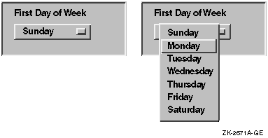
Figure 1-36 shows how you would use two option buttons to present the same choices that the user is given in Figure 1-33. Figure 1-36 Using Two Option Buttons 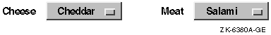
If you create a set of option buttons together, either in a row or in a column, align them horizontally or vertically as appropriate to provide a pleasing layout. If the buttons are approximately the same size, you should make the option buttons the same width.
|