|
DECwindows Companion to the OSF/Motif Style
Guide
1.5.6.6 Initializing Values in Dialog Boxes
When a dialog box is displayed the second time, you should try to
preserve the values for all the fields. For example, when users display
a Create dialog box again, they might want to retain most of the values
that were already entered. Preserving these values saves users from
having to reenter all the information. In the case of a Directory
dialog box, users might want to display the same elements the second
time, but change the contents of one of the fields, such as the time
last modified.
1.5.6.7 Provide a Variety of Selection Controls
Provide selection controls (such as radio buttons or list boxes) and
text-entry fields to gather the same information, when suitable. Doing
so accommodates different user preferences for entering information.
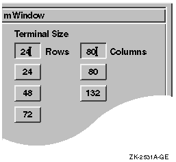
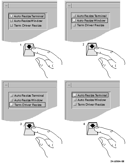
For example, Figure 1-37 shows a dialog box that allows users to
customize the size of their windows by either typing in the size in a
text field or by selecting the appropriate push button.
Figure 1-37 Provide a Variety of Selection Controls
Be careful, however, to avoid clutter by providing too much variety.
Also, do not overwhelm users with too many visual features, such as
flashing, bolding, and underlining. In general, avoid using flashing
because it distracts the user.
1.5.7 Creating Tab Groups
A tab group consists of any managed or primitive
widget that is organized into a traversable group or field.
In other words, a tab group is a group of controls that belong
together. For example, a set of radio buttons is a tab group. To move
from tab group to tab group in a dialog box, users press the Tab key
(hence the name tab group).
Organize the controls in your dialog boxes into distinct tab groups.
The toolkit makes two distinctions with regard to navigating dialog
boxes with the keyboard:
- Navigating between tab groups
- Navigating within tab groups
1.5.7.1 Navigating Between Tab Groups
Treat each of the following types of controls as its own tab group:
- List boxes
- Sashes
- Scales
- A single-line text-entry field
- A set of radio buttons
- A set of check buttons
- One option button preceded and followed by a different type of tab
group
A group of option buttons together makes one tab group.
Follow these general rules for navigating between fields:
- Allow users to navigate the dialog box in the same direction as the
language of the dialog box. That is, place the location cursor in the
top left of the dialog box, and when users press the Tab key, move the
location cursor from left to right, top to bottom from tab group to tab
group in a predictable manner.
Programming
Hint
To retain the proper order, create children in the same order in which
users tab through the dialog box.
|
- If users leave the dialog box to give input focus to another
window, do the following when users give input focus back to the dialog
box:
- If users click over a specific control in the dialog box, give that
control the input focus.
- If users click in a general area (such as the title bar or a blank
space), or if users use the keyboard to assign input focus, place the
location cursor on the component that last had the location cursor on
it.
Refer to Figure 1-38 and Figure 1-39 to see how the input focus moves
from tab group to tab group when users press the Tab key. The location
cursor wraps from the bottom right tab group to the top left tab group
when users continue to push the Tab key.
Figure 1-38 Use the Tab Key to Move Between Tab Groups
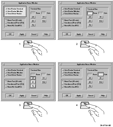
Figure 1-39 Use the Tab Key to Move Between Tab
Groups--continued
1.5.7.2 Navigating Within Tab Groups
To move from component to component within a tab group, users press the
arrow keys. For example, to move from one item to the next in a series
of radio buttons, users press the down arrow key. However, to move from
a radio button to the next tab group, users press the Tab key.
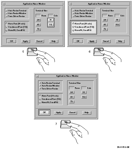
Refer to Figure 1-40 to see how the input focus moves from component
to component within a tab group when users press the arrow keys. Notice
that the location cursor wraps; that is, when users
press the down arrow key to go to the last item in a series and then
press the down arrow key again, the location cursor moves up to the
first item in the series.
Figure 1-40 Use the Arrow Keys to Move Within Tab
Groups
1.6 Presenting Text in Dialog Boxes and Other Screen Objects
When creating labels and text for dialog boxes and other screen objects
such as menus and title bars, follow these guidelines:
- Avoid using all uppercase letters for text. Mixed case improves
readability and style.
Use:    Null Pointer

Avoid:  NULL POINTER
|
- Follow the capitalization rules of the local or translated
language when you use local or translated words.
- For dialog boxes, wherever possible, use sentences or
sentence-like wording. Capitalize the first word of each sentence. Use
sentence punctuation unless such marks could confuse literal displays,
such as file names.
Loading file /usr/sbin/uerf.hlp

The file /usr/sbin/uerf.hlp cannot be found.
Please check the file name and directory for spelling
or other errors and try again.
|
- Capitalize each word of a screen object within a dialog box (such
as labels for toggle buttons, radio buttons, or text-entry fields)
except for articles and prepositions that have less than five
characters and fall between two other words.
Levels with Periods
Number of Columns
Space Between Columns
First Line Indent
Dates Before 1993
|
- Capitalize the first letter of each word in a push button. An
exception is the OK push button where both letters are uppercase.
- Capitalize the first letter of each word in a menu name, menu
item, or label, except for articles and propositions that have fewer
than five characters and fall between two other words.
Show Room
Go to Page...
Save As...
|
- If a menu name, menu item or label uses a hyphenated word,
capitalize the first letter of the first word and the first letters of
all other words that are nouns or proper adjectives or that have the
same importance as the first word. Use all lowercase letters for any
articles, conjunctions, or prepositions that fall between two major
words.
Side-by-Side

Cross-References
|
1.7 Creating Title Bars
Title bars are used in both primary and secondary windows.
For primary windows, provide labeling as follows:
For secondary windows, provide labeling as follows:
- Center the title of the window in the title area. (Centering is
the default.)
- If the secondary window is a dialog box, give the dialog box a
title that consists of the application name followed by a colon and the
command that created it.
For more information on naming dialog boxes, see Section 1.2.1.
1.8 Using the Working Dialog Box and the Wait Cursor
Use Working dialog boxes and wait cursors to give the user immediate
feedback that your application is in process.
In most circumstances, if the action will take more than 15 seconds,
use a Working dialog box to show work in progress. Since the length of
time that an action takes is system dependent to a large extent, you
might want to make the display of a Working dialog box be a
customizable option.
When actions will take less than 15 seconds, let the user know the
application is processing by changing the cursor to a wait cursor such
as the DECwindows watch cursor. Continue to display the wait cursor
until the action is complete. Use a wait cursor for the following types
of actions:
- Selecting a menu item that will bring up a dialog box
- Performing a direct action
- Scrolling a window
- Expanding or collapsing items
- Selecting OK or another button in a dialog box
Set the wait cursor on all windows where the user is waiting for an
application to complete an action. For example, if the application is
refreshing a directory, the wait cursor should be set in the directory
window as well as all other windows that are visible and pending the
completion of that refresh.
Programming
Hint
Use the following code example to set a wait cursor for the active
window. The #ifdef is used when the application runs on an OpenVMS
system. The other include statement applies to both UNIX and Windows NT
systems.
#ifdef OpenVMS
#include <decw$cursor.h>
#else
#include <X11/decwcursor.h>
#endif
#include <DXm/DECspecific.h>

  /* Wait? */
  if ( wait )
    /* Set the wait cursor for this window. */
    waitCursor = DXmCreateCursor(widget,decw$c_wait_cursor);
  else XUndefineCursor(XtDisplay(widget), XtWindow(widget));
|
|
Chapter 2
Designing Menus and Menu Items
This chapter provides guidelines for designing menus. It supplements
the OSF/Motif Style Guide by discussing the following topics:
- Naming menus and menu items
- Organizing menus and menu items
- Using ellipses in menu items
- Disabling menu items
- Designing pop-up menus
- Designing tear-off menus
This chapter also discusses the OSF/Motif File, Selected, Edit, View,
Options, and Help menus, and recommends items to add to these menus. In
addition, you can include a Windows menu and your own
application-specific menus.
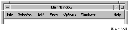
2.1 Naming Menus and Menu Items
Use the standard terms for common menus, such as File, Selected, Edit,
and Options. In left to right environments, place the menus in the
recommended order, with File farthest to the left, followed by
Selected, and then Edit. Application-specific menus should follow the
Edit menu. Place the View, Options, and Help menus to the right of any
application-specific menus. The Options and Help menus should always be
farthest to the right. If you include a Windows menu, place it between
the Options and Help menus. See Figure 2-1 for an example.
Programming
Hint
To position the Help menu at the far right of the menu bar, set
XmNmenuHelpWidget to the name of the Help cascade button.
|
Figure 2-1 Order of Menus in the Menu Bar
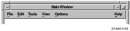
Additional menu bar items should be placed after Edit and before Help.
When there is a View menu bar item, most additional items should be
placed between Edit and View. In this way, users become accustomed to
the File, Selected, and Edit menus appearing at the left and the View,
Options, and Help menus appearing at the right. Figure 2-2 shows two
application-specific menu bar items.
Figure 2-2 Sample Menu Bar with Application-Specific
Items
When you are creating your own menus and menu items, avoid giving a
menu the same name as a menu item. For example, Paste is an item on the
Edit menu, so do not create a Paste menu in the menu bar.
Use verbs or adjectives for your menus and menu items instead of nouns.
Verbs and adjectives give users a better idea of what action a command
will perform.
Follow the guidelines for text presentation (such as capitalization and
punctuation) in Section 1.6.
Use terminology that will be familiar to users. For example, if you are
designing a simple drawing tool, avoid terms like chamfer or bevel, but
if you are designing a drawing tool for graphic artists, use these
terms. Whatever terms you choose, make sure they are distinct from each
other. Ask users to review your choices of menus and menu items and to
tell you if the terms are clear and distinct.
Give each menu and each menu item a mnemonic. Consider giving the most
commonly used menu items accelerators.
Programming
Hint
To create a mnemonic and an accelerator, use the following code example:
object copy_button : XmPushButton
    {
        arguments
            {
                XmNlabelString      = "Copy";
                XmNaccelerator      = "Ctrl<Key>Insert";
                XmNacceleratorText  = "Ctrl+Ins";
                XmNmnemonic         = keysym("C");
            };
    };
|
|
For information on capitalization of menu items, see Section 1.6.
2.2 Organizing Menus and Menu Items
The way you organize your menus and menu items depends on your
application. Choose the most appropriate guidelines from the following
list to help you:
- Create logical groupings of menus and menu items.
Menu items
can be composed of either text or graphics, and can span multiple
lines. Within a menu, use horizontal separators (lines) to form logical
groups and separate menu items. For example, on a menu for editing a
document, place all graphical menu items together, and all textual menu
items together, and separate the two groups with a line.
Place together sets of related items and separate them from other
menu items by a horizontal separator. Let users help you decide what
constitutes a logical group.
- Place menu items within the menu in the order of most common use.
In general, place the most commonly used commands first in the menu
and the least frequently used commands last. Involve users in your
design and testing so that you will know which menu items are most
commonly used.
You can also arrange menus items in groups, and
within those groups arrange them according to frequency of use. For
example, you might place Exit and Close at the bottom of a menu (even
though they are used often) to be consistent with the placement of
Close in the window menu.
- Organize menu items in a perceivable order.
For example,
arrange a list in alphabetical order, or arrange the menu items from
the smallest unit of measurement to the largest (for example, type size
from 8 points to 24 points).
- Put related opposite menu items in the same menu.
For example,
place Show and Hide, and Undo and Redo in the same menu, or create a
menu item that changes depending on the context. For example, have the
Undo menu item change to Redo if users have just performed an Undo
operation.
- Do not put a destructive command (such as Delete or Revert) next to
other frequently chosen items.
One of the most common user problems
with menus is the off-by-one error, in which users mistakenly choose
the item next to the one intended. Be aware of the result if users
choose the menu item above or below the intended item. If, however, a
destructive function logically goes with a frequently chosen item, make
sure that the users can undo the destructive function, or make sure you
provide a question dialog box that confirms that users really want to
perform the destructive option.
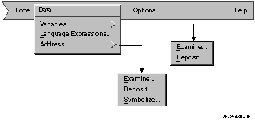
- Use no more than three levels of menus, as a rule.
Consider providing a menu map, either on line or in hardcopy form.
Some products provide one map of all menus and menu items, while others
provide separate diagrams for each menu and its associated submenus.
Figure 2-3 shows a map for one menu and its associated submenus.
Figure 2-3 A Menu Map
2.3 Using Ellipses in Menu Items
Use a horizontal ellipsis (...) to indicate that pushing the button
invokes a dialog box or window that requires some action on the part of
the user. For example, use an ellipsis with the Print menu item if it
invokes a dialog box in which users must provide printer information
before a file can be printed.
Do not use ellipses with the Help push button or Help menu item since
Help does not require any action. (For information on designing online
help, see Chapter 5.)
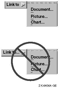
Do not take short cuts when providing ellipses in cascade buttons.
Always use ellipses in cascade menu items. Figure 2-4 shows the
appropriate way to use ellipses with cascade buttons.
Figure 2-4 Ellipses with Cascade Buttons
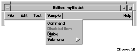
2.4 Disabling Menu Items
At a given time, your application can make a menu item unavailable to
users; that is, it can disable the menu item. Users cannot choose a
disabled menu item. Figure 2-5 illustrates a disabled menu item.
Figure 2-5 A Menu with a Disabled Menu Item
Programming
Hint
To disable a menu item, call XtSetSensitive with the widget ID of the
widget.
|
You can allow users to display a menu or submenu in which all items are
disabled. With such a display, users can see what features your
application provides. (This guideline does not necessarily apply to
pop-up menus; for guidelines on pop-up menus, see Section 2.5.2.)
If your application does not support a standard menu item, do not
display that menu item at all. For example, if your application does
not support the Select All menu item, do not include Select All in a
menu.
Use the following guidelines to determine whether to disable a menu
item:
- Disable menu items for operations that users cannot do; that is,
menu items that would cause an error or result in no action when users
chose them.
For example, disable the Cut menu item from the Edit
menu if users have not selected anything to cut; disable an Undo menu
item if users cannot undo the last operation.
- Do not disable menu items for operations that users can do, even
if doing them does not change anything.
For example, do not disable
a Select All menu item, even if users have already selected all items.
It is best not to disable Select All because doing so could cause
confusion to users.
Some menu items invoke dialog boxes; your decision to disable such menu
items depends on whether the dialog box that is invoked is modal or
modeless:
- If the menu item invokes a modal dialog box that requires some
context, such as the selection of a mail folder, you can do either of
the following:
- Disable that menu item if choosing it would cause an error or
would display a dialog box with no meaningful context.
- Enable that menu item if users can provide meaningful context
within the dialog box, for example, by entering the mail folder name.
In such cases, you should disable the OK and Apply push buttons until
the dialog box has some context.
- If the menu item invokes a modeless dialog box, keep the menu item
active, and display the associated dialog box when users click on the
menu item.
However, disable the OK and Apply push buttons on the
dialog box. Because the dialog box is modeless, users have the ability
to make changes, and might make a change that renders the dialog box
useful. If users make such a change, enable the push buttons on the
dialog box.
For example, if a graphics editor has a menu item called Align
which invokes a modeless dialog box, users should be able to click on
Align and see its associated dialog box, even if they have not created
or selected any objects to align. If users have not created or selected
any objects to align, disable the push buttons in the dialog box.
However, once they create or select a few objects, change the push
buttons from disabled to enabled.
|