|
DECwindows Companion to the OSF/Motif Style
Guide
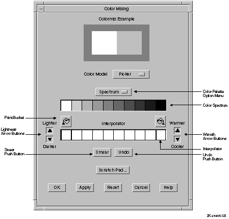
4.3 Using Digital's Color Mixing Widget
Use Digital's Color Mixing widget to provide users with the ability to
customize the colors used in your application. For example, if your
application includes graphics, such as a pie chart, you can provide
access to the Color Mixing widget through an item in a customization
menu to allow users to define the pie chart's colors.
The Color Mixing widget provides users with immediate feedback,
displaying each new color as it is defined. There is also a scratch pad
feature that allows users to save colors that they want to use later or
to compare colors.
By default, the Color Mixing widget supports five color models. You
can, however, customize the Color Mixing widget to support other color
models.
Color models are abstractions that enable users to choose specific
colors. The Color Mixing widget supports the following color models:
For more information on the Color Mixing widget, see the DECwindows
Motif Guide to Application Programming and the DECwindows
Extensions to Motif.
Chapter 5
Designing Help
Provide online help as part of your application. The methods and
techniques of designing online help vary with each company; in some
companies, technical communicators design the online help, while in
other companies application developers design it. Regardless of who
designs and implements the online help, this chapter covers the
following:
- Methods of accessing help
- Guidelines for designing and writing help
- Digital tools for creating online help
- The Help widget
- The DECwindows Motif Help System
5.1 Methods of Accessing Help
Allow users to access online help through one or more of the following
mechanisms:
- Help pull-down menu
- Help command
- Help push button
- Help key
5.1.1 Help Pull-Down Menu
Each type of help corresponds to a menu item in the Help menu. Make
sure that your Help menu includes only the types of help that your
application provides. For an example Help menu and an explanation of
what each menu item is to do, see Figure 2-16.
5.1.2 Help Command
If your application makes use of command dialog boxes or command
regions, allow users to invoke help by typing the help command at the
prompt and pressing Return.
5.1.3 Help Push Button
Provide a Help push button in most dialog boxes. When users push the
Help push button, have them receive an overview of the dialog box and
additional topics that describe how to use each control within the
dialog box.
If your application uses warning or error dialog boxes, provide a Help
push button in each dialog box if the error and a solution cannot be
given in one or two lines of text. Have the help that users receive
describe the error or warning displayed in the dialog box, and provide
a suggestion for solving the problem.
5.1.4 Help Key
When users press the Help key, have them receive context-sensitive help
on the component that has the location cursor. However, if the input
focus is in a dialog box and users press the Help key, have them
receive an overview of help for the entire dialog box, not just the
component that had input focus.
5.2 Guidelines for Designing and Writing Online Help
Because online help, especially context-sensitive help, must provide
separate information about individual tasks or concepts, the
information is divided into separate Help topics.
5.2.1 Planning Help Topics
Before you begin to write, plan the topics on which you will write
help. Here is a list of steps to guide you:
- Create a hierarchical list of all the application's screen objects.
This includes menus, menu items, pop-up menus, dialog boxes, and
controls (fields) within each dialog box.
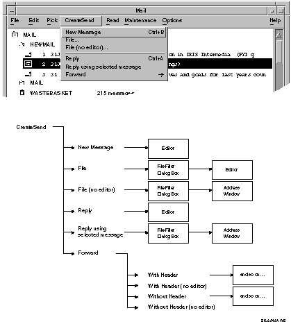
For example, one branch
of this hierarchical tree for Mail might begin with the Create-Send
menu, as shown in Figure 5-1. Each menu item is a smaller branch off
the main branch. Dialog boxes and submenus are still smaller branches,
and the controls within the dialog boxes are the leaves at the end of
the branch. Your diagram might look similar to the one in Figure 5-1.
Figure 5-1 Create a Hierarchical Tree
- Once you have created your hierarchical list, create a list of
tasks that users might want to accomplish and check this list with
actual users. Then map the tasks back to menus, menu items or dialog
boxes; that is, for each task, see if there is a clear means of
accomplishing that task.
If you have trouble mapping tasks back to
screen objects, it may be because you have not listed representative
tasks, or because the user interface has not been designed in a
task-oriented fashion. If the latter is the case, see if there are menu
names or control labels that can be changed to make the interface more
task oriented.
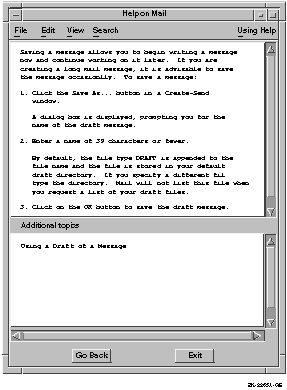
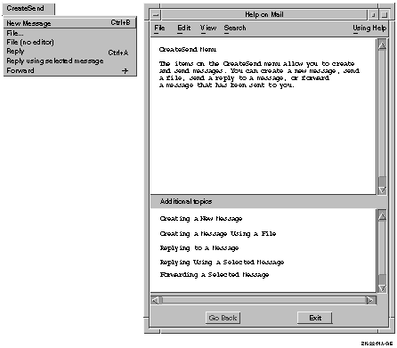
For example, Figure 5-2 shows a Help window that
describes the Create-Send menu, and a list of additional topics. Notice
that the additional topics correspond to the items in the Create-Send
menu, and each task-oriented additional topic can be mapped back to a
menu item. For example, the first topic says Creating a New Message and
the associated menu item is New Message.
Figure 5-2 Create Task-Oriented Topics
5.2.1.1 Organizing Help Topics
Once you have created a hierarchical list of the screen objects and
their associated tasks, you are ready to begin organizing your help
topics. You may want to use the following steps to help guide you:
- Write an overview of the application that quickly describes what
tasks users can accomplish with it. List as additional topics (or
create DECwindows Motif Help System hotspots for) the general tasks
that users can perform using the menus in the title bar. You may also
have other additional topics.
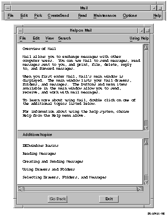
For example, Figure 5-3 provides
an overview and introduction to mail, and as additional topics it lists
"Reading Messages" to correspond with the Read menu, and
"Creating and Sending Messages" to correspond with the
Create-Send menu.
Figure 5-3 Write an Overview for the Application
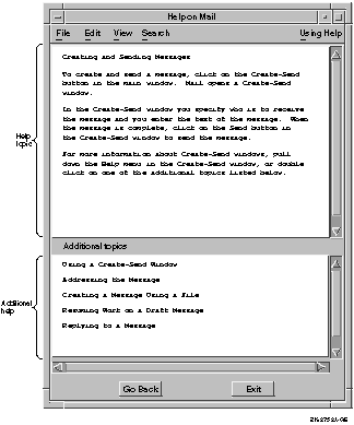
- For each menu, write a short overview of what tasks the items in
this menu can help users accomplish. List as additional topics the
tasks that each menu item will perform; do not just list the menu
items. (Users can see a list of menu items by posting the menu. If
users are in help, they need information on performing specific tasks.)
Notice that the overview of the Create-Send menu in Figure 5-2
has additional task-oriented topics that correspond with each menu
item.
Also, consider using additional topics (or hotspots) for more
than simply showing the hierarchical breakdown of an interface; use
additional topics to show relationships between various parts of an
interface. For example, help on the Create-Send menu item might include
an additional topic on how to set a personal name or how to set an
editor.
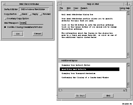
- For each dialog box, write a short overview of the tasks that users
can accomplish using that dialog box and tell users how to accomplish
those tasks using the dialog box. If the dialog box is large or
complicated, list as additional topics (or hotspots) the tasks that
users can perform using each control in the dialog box. Then, in a
subsequent Help window, provide detailed information on how to use each
specific control.
Notice that the overview of the Send attributes
dialog box in Figure 5-4 lists additional topics that correspond
with each control (or set of controls) in the dialog box. The
additional topics are listed in a specific order; the list begins with
the control in the upper left corner of the dialog box, and goes left
to right, top to bottom (in left-to-right environments).
Figure 5-4 Additional Topics in a Help Window
- Decide which Help topic will be invoked when users obtain
context-sensitive help using the mouse. For example, when users click
on the menu bar, but not on a specific menu, will you invoke an
overview of the application, an overview of the menu bar (if you have
decided to write one), or help on the closest menu?
- When users press a Help push button in a dialog box, have them
receive help on the dialog box as a whole, or receive an overview of
the dialog box with additional topics about each control. If users
press the Help key when input focus is in the dialog box, provide help
on the specific control that has the input focus.
- Decide how to organize each task-oriented topic. Consider the
following:
- Decide which additional topics to place in the Additional Topics
list.
5.2.1.2 Writing Help Topics
Writing Help topics requires accuracy and clarity, and knowledge of
users, as does writing hardcopy documentation. The screen is a
different medium from the printed page, however, so writing Help topics
requires a different type of writing style. Three important guidelines
for writing online help are as follows:
- Be brief
- Be clear
- Be visual
Be Brief
Make help text brief so it can fit in the default size of the Help
window, and to make the user's job easier. Use the following guidelines
to make your Help topics concise:
- Use as few words as possible, but do not omit words such as
the and a for the sake of brevity. The resulting
telegraphic style can lead to misinterpretation and mistranslation.
- Avoid a chatty, overly friendly style.
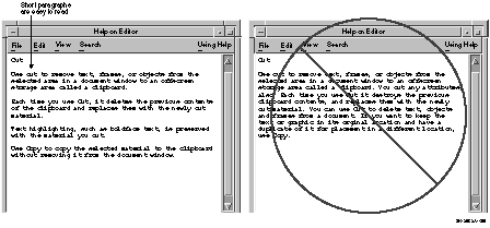
- Use short sentences and short paragraphs. Figure 5-7 compares
the use of brief paragraphs with a lengthy one.
- Help the user do a task.
For example:
     Use Print...to display the Print Attributes dialog
     box to prepare and send your document to a printer.
|
- Write imperative sentences and avoid the passive voice; for example:
Use Save to save your document in a file.
|
Not:
The Save menu item is used for saving your document in a file.
|
Figure 5-7 Use Short Sentences and Paragraphs
Note
The art examples in this chapter reflect the Help widget rather than
the DECwindows Motif Help System. However, the guidelines can be
applied to either.
|
Be Clear
Use simple, nontechnical language. Write for the beginning user of the
application, and avoid jargon, including computer jargon, product
jargon, and help jargon. For example, avoid referring to the list of
additional topics as a list box. Use the following guidelines to make
your Help topics as clear as possible:
- Use simple language.
- Use direct instructions.
- Define all new terms whenever you use them. Define terms in
lower-level topics if users can view the topic without viewing a
higher-level topic.
After defining a term, use it. Avoid synonyms.
- Spell out abbreviations, acronyms, and mnemonics and follow with
the shortened form in parentheses.
- Use the same terms that are used in the user interface, where
possible. For example, refer to the DECterm window, not the
terminal emulator window.
Figure 5-7 shows the first and final drafts of a sample Help topic.
The revised Help topic breaks the text into short paragraphs separated
by blank lines and reduces the density of the text, thus making it
easier to read on the screen. For optimum readability, limit topics to
four or fewer short paragraphs whenever possible.
Be Visual
Try to design Help topics that are inviting to the eye and easy to
read. Reading information on a screen is more difficult than reading it
on a page. Screen resolution may be as much as 20 times lower than the
resolution of a printed page; text density that is acceptable on a page
is unacceptable on a screen.
You can create a visual format that is easy to read by following these
guidelines:
- Break text into short paragraphs separated by blank lines. A high
text density with little blank space is hard to read.
- Make the text have a ragged right margin; do not right-justify it.
Ragged right margins help readers to keep their place in a section of
text.
- Use blank lines between list items, if possible. If the list is
short and fits in one Help topic without scrolling, then consider
omitting the blank lines.
Create short list items, if possible.
- Write topics that fit within the default Help window dimensions so
users do not need to scroll.
If your Help topic must exceed the
number of lines that your help window displays, you can position the
text to give users another cue (in addition to the scroll bar) that
more information follows. For example, have the text go to the bottom
of the window so that users can see the tops of letters being cut off.
For each Help topic you write, provide a list of additional topics that
contain related information.
5.2.2 Remember Translation
It is important to follow the recommendations for writing style given
in this chapter in order to assist in the translation of help files.
When a Help topic is translated from an English language version, the
amount of text usually increases, so plan for this text expansion.
In addition, to prevent users from having to scroll the help text,
translators can request that the default size of the Help window be
increased to accommodate the increased amount of text.
5.3 Digital Tools for Creating Online Help
Digital provides two means for creating and displaying online help: the
Help widget and the DECwindows Motif Help System.
5.3.1 Using Digital's Help Widget
Digital's Help widget is a special window that users can invoke from
the Help menu, the Help command, the Help push button or the Help key.
The top pane of the Help window displays the Help topic, that is,
information on the object or function on which users request help.
The bottom pane lists additional topics for further help. To select and
display an additional topic, users position the pointer over the topic
and click MB1.
A Motif Help Window created with Digital's Help widget consists of the
following components:
- Title bar with the title centered and a window menu button
- Menu bar
- Help topic
- Additional topics
- Push buttons
The default size provides space for 55 monospaced characters on a line
of text, 20 lines of text, and space for 5 subtopics in the Help
window. Figure 5-8 shows a sample Help window.
Figure 5-8 Help Window
5.3.1.1 Title Bar
The title bar consists of the help title and the window menu button.
The help title consists of the phrase "Help on" and the name
of your application, as shown in Figure 5-8.
5.3.1.2 Menu Bar
The menu bar of the Help window contains the following menus:
- File
The File menu contains the following menu items:
- Save As..., which invokes a dialog box that allows users to save a
copy of the current Help topic in a specified file.
- Exit, which dismisses the current Help window.
- Edit
The Edit menu contains the following menu items:
- Copy, which copies a selected portion of the current topic to the
clipboard.
- Select All, which selects the entire current topic.
- View
The View menu contains any or all of the following menu items:
- Go To, which replaces the current topic with the selected
additional topic. If no topic is selected in the Additional topics
area, disable this menu item.
- Go Back, which replaces the current topic with the previous topic.
The Go Back menu item duplicates the function of the Go back button.
If no previous topic exists, disable this menu item.
- Go to Overview, which replaces the current topic with the
application-specific On Window topic. Each application must have an
overview topic.
- Visit, which creates a new Help window that displays the selected
additional topic. The previous window displays the current Help topic
and retains the input focus. Note that input focus is not passed to the
new help window.
If no topic is selected in the Additional topics area, disable this
menu item.
- Go to Glossary, which provides an alphabetic list of terms
associated with your application.
- Search
The Search menu contains the following menu items:
- History..., which
invokes a modeless dialog box that lists the titles of all the Help
topics viewed during the current help session. The History dialog box
contains a list box with the topic titles and Go To, Visit, and Cancel
push buttons.
- Title..., which invokes a modeless dialog box that allows users to
display a list of topic titles that contain a keyword or phrase.
- Keyword..., which invokes a modeless dialog box that allows users
to search for Help topics related to specific words.
- Using Help
The Using Help menu contains an On Window menu item
that invokes help on how to use the Help window.
5.3.1.3 Help Topic
A Help topic uses text to describe an object, concept,
or function on which the user requested help. Have your application
display the application-specific On Window topic when users do not
request help on a specific topic.
|