 |
DECwindows Companion to the OSF/Motif Style
Guide
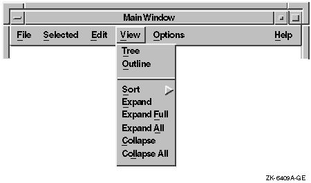
2.10 Items in the View Menu
The View menu is optional. It contains items that change the user's
view, but not the actual data.
For example, in Figure 2-15, the first group of items changes the
entire view by displaying a tree or outline view; the second group
expands or collapses the items in the view.
The Expand menu item expands the currently selected item one level
deeper. Expand Full expands the selected items to their full depth.
Expand All expands all the items to their full depth.
Collapse contracts the selected items. Collapse All contracts all the
items.
Figure 2-15 A View Menu and Its Menu Items
2.11 Items in the Options Menu
Provide commands in the Options menu for customizing your application.
The menu items in the Options menu depend on your application. Give the
Options menu a mnemonic of O. For more information and an example of an
Options menu, see Section 3.1 and Figure 3-1.
2.12 Items in the Help Menu
The Help pull-down menu can contain any of the items shown in
Figure 2-16.
Note that OSF/Motif does not require your application to have all these
items on a Help menu. However, if your application has one of these
items, it must conform to OSF/Motif specifications.
Include only the Help menu items that your application supports.
Figure 2-16 A Help Menu and Its Menu Items

The following list shows the menu items and the results when users
choose them:
Context-sensitive Help
Initiates context-sensitive help by changing the shape of the pointer
to a question mark. The user then moves the pointer to the area or item
on which help is needed and presses MB1. After the selection, the
pointer returns to its previous shape.
Overview
Provides a brief description of the current window. The description
includes information about the function of the window and the tasks
that users can perform using that window.
Index
Gives users an index to all help information in the application.
Keyboard
Shows the meanings assigned to keys, especially function keys, by your
application. You can use a Shortcuts menu
(Shortcuts) instead of the Keyboard menu item
to show the meanings of both key and button bindings.
Tutorial
Provides access to an online tutorial about your application.
Glossary
Provides an alphabetical list of terms used in the online help.
Using Help
Provides information on how to use the help facility.
Product Information
Provides information about your application, including the name,
version, date, and copyright data.
Place any additional menu items between Index and Using Help.
For information about designing and writing online help, see
Chapter 5.
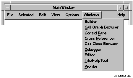
2.13 Items in the Windows Menu
The Windows menu is optional. If your application uses multiple main
windows, place the titles of currently active primary windows in the
Windows menu. When a user selects a title from the Windows menu,
display that window. A Windows menu gives the user immediate access to
any active primary windows in your application without the need to
shuffle through the windows on the screen. In some instances, you might
also want to place the names of currently active secondary windows in
the Windows menu.
Figure 2-17 shows an example of a Windows menu.
Figure 2-17 A Windows Menu
Chapter 3
Customizing the Interface
Design your application so that it follows the principles of good user
interface design, as explained in the OSF/Motif Style Guide. In addition,
design your application so that users can customize important functions
to meet their specific needs. Customization is discussed only in this
document and not in the OSF/Motif Style Guide.
Allow users to customize your application by using menus and dialog
boxes. Provide an Options menu in your application to help users tailor
the application to their needs.
No matter what type of user interface you are creating, consider
allowing users to customize the following:
- Window positions
- Colors
- Size and rendition of text
Other types of customization depend on your application. These types of
customization include startup procedures, keyboard accelerators, and
print and plot settings.
This chapter provides general guidelines for customizing your
application, and some specific guidelines for customizing startup
procedures, window positions, colors, and text.
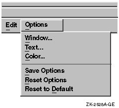
3.1 General Guidelines for Providing Customization Features
Allow users to customize your application by using the Options menu.
Divide this menu into at least two sections. In the top section, place
the items needed to customize specific features of the application. For
example:
- Command menu items
- Dialog menu items
- Submenus containing command or dialog menu items
In the bottom section, place items for saving and restoring settings.
Figure 3-1 illustrates an example Options menu.
Figure 3-1 An Example Options Menu
If your application has more than one window, provide an Options menu
in the main window to customize settings throughout the application.
Then, give each additional window an Options menu for settings specific
to it.
Place the Options menu on the menu bar to the right of all other menu
names except Help.
Your application can provide customization of settings in windows at
any level. Make customized settings apply to the window in which the
user specifies it, as well as to all its descendant windows. In
addition, allow a customized setting in a child window to override the
same setting specified by its parent.
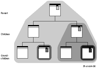
Customization can be inherited from a parent window or specified in a
child window. For example, a dialog box inherits its font setting from
the mail application that displays it unless the font is customized at
the dialog box level. In Figure 3-2, several windows provide
customization for a particular setting, represented by a shaded
pull-down customization menu. The range of customizing at different
levels is indicated by the shaded areas. The setting represented by
each menu shade is in effect throughout the range of windows within the
area of the same shade.
Figure 3-2 Range of Customization
If you do not provide customization in a window, or if the user has not
chosen settings, have the window inherit its settings from its parent
window.
Have your applications provide customization for each setting at the
highest possible level at which the setting is meaningful.
For example, customize a setting at the application level if it makes
sense for each of the application's tools to share that setting.
In addition, applications can provide overriding customization in
lower-level windows in the following situations:
- The feature has particular significance or importance in the
lower-level window.
For example, in a mail application, users can
customize the editor they use by choosing the Send... menu item from
the Options menu in the main window. However, they can also change the
editor in the Create window by choosing a menu item in the Change
Editor menu.
- The feature will be changed frequently in the lower-level window.
For example, in a mail application, users can customize their
personal names by choosing the Send... menu item from the Options menu.
However, because users may want to change their personal name
frequently depending on the content of the message, they can also
change their personal names in the Create window.
Retain the results of settings
until users exit the application, unless the users save them. When
users exit the application, consider having a dialog box that asks them
to save settings.
If users save the settings, use them the next time the application is
invoked and have the settings remain in effect until users choose new
settings.
3.2 Designing Options Menu Items and Dialog Boxes
Give the Options menu and associated dialog boxes all the customization
features appropriate for your application. However, excessive or
gratuitous customization can overload the user with too many decisions
to make. It may not be necessary to include all the customization
described in this chapter in your application.
Know your users' needs; provide flexible customization options for
important features, but select a good standard setting and provide no
customization for unimportant features. Provide customization for
features that will help users feel more comfortable and in control, and
that will make their tasks easier to perform. When appropriate, provide
a list of common defaults rather than an open-ended text field. Use an
option menu widget or a list box for the list of defaults. Such lists
enable users to customize the application rapidly.
Remember that even if your application is not being translated, it may
be used throughout the world by people for whom English is a second
language, so you might want to allow users to customize time, date, and
monetary units.
As you design your application, you may become aware of different ways
to allow users to do the same thing. In such cases, consider providing
settings that enable users to choose the method they prefer. For
example, the Motif window manager allows users to choose between an
explicit (click-to-type) and an implicit (pointer) focus policy.
You can add menu items, submenus, and menu items that lead to dialog
boxes. The following sections give you a few guidelines for adding menu
items and dialog boxes.
3.2.1 Adding Command Menu Items
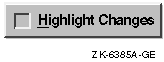
Use menu items to allow users to customize one setting at a time. For
example, use a check box in a menu such as Highlight Changes to allow
users to turn highlighting on or off.
If you have a menu with many items, group them within the menu by using
separators, like the example Options menu shown in Figure 3-1.
For more information on designing menus, see Chapter 2.
3.2.2 Adding Dialog Boxes
Use dialog boxes to allow users to customize several things at once.
Decide when to make separate dialog boxes for customizing. For example,
decide whether to make a single dialog box for customizing text and
color options, or whether to make a separate dialog box for each.
Here are a few guidelines for using dialog boxes:
- Find logical groupings of customizable features.
For example,
group all choices for customizing text (font, rendition, point size) in
one dialog box, and all choices for customizing graphical objects
(color, thickness of lines) in another.
Involve users to tell you
what they think is a logical group. You do not need a working prototype
to do this. Consider giving users a generic dialog box drawn on paper
and cutouts of controls that they can arrange, or having them redraw
dialog boxes using a graphics editor or other prototyping tool.
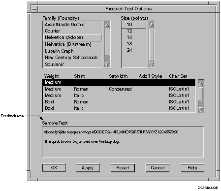
- Provide feedback areas or include an Apply push button to show the
effects of various settings without actually changing them.
See the
Sample Text section of Figure 3-3 for an example.
- Include a Reset button so users can reset the information in the
dialog box without canceling it.
- Keep an appropriate number of tab groups in one box; avoid clutter.
Involve users so that they can let you know when they feel you are
putting too many options in one dialog box.
- Use an option menu widget, list box, or other widget to provide a
list of the default values for options. Whenever possible, avoid using
open-ended text fields or numeric scale widgets.
The following
figure illustrates an inappropriate and an appropriate way to enable
users to customize the icon size.
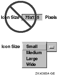
When full user flexibility is needed, include an Other option. When
the user selects Other, enable a text field as shown in the following
figure.
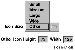
Figure 3-3 Feedback Area Labeled "Sample Text"
3.3 Guidelines for Customizing Windows, Color, and Text
This section provides specific guidelines on customizing the following:
- Window positions
- Colors
- Size and rendition of text
3.3.1 Window Positions and Sizes
Allow users to customize and save the positions of windows so that each
time they invoke the application, the windows appear in the same
positions. There are several ways to do this:
- Save the positions and sizes of windows automatically when users
exit the application.
- Use the Options menu item Save Options to save the positions of
windows automatically, in addition to saving other options.
- Create a menu item in the Options menu called Save Window Positions.
Do not make users specify the X and Y pixel values for window
positions. Users generally prefer direct manipulation. If you must
provide window position dialog boxes that allow users to specify X and
Y pixel values (for example, in a program where exact placement is very
important), also provide a way for users to customize their window
placement through direct manipulation.
3.3.2 Colors
Allow users to customize and save the colors of an application so that
each time they invoke the application, the same colors appear. If you
are using color to show scale or intensity, allow users to choose
colors that are meaningful to them. Try to keep users from doing
counterproductive things, such as making both the background and the
foreground the same color.
Digital provides the Color Mixing widget that you can include in your
application to enable users to customize their colors. The Color Mixing
widget provides users with a consistent way to customize colors across
applications. For information on the Color Mixing widget and on using
color in your application, see Section 3.3.2.
If your application does not update color changes immediately, you
might want to provide feedback by displaying a message dialog box that
tells users when they will actually see the color changes take place.
3.3.3 Size and Rendition of Text
If your application uses text, allow users to customize that text by
changing font family, point sizes, and rendition. Allow users to save
customized text settings so that each time they invoke the application,
the customized settings are invoked. If your application allows for
limited customization of text, place the text customization menu items
in the Options menu to be consistent with other aspects of
customization. In cases where you allow extensive or sophisticated
customization of text (in text processors, for example), provide a
separate menu because your application will allow users to customize
text in many different ways.
The way that you implement customization of text will depend on the
number of different font families, point sizes, and renditions that you
provide, and on how often users will be changing text settings.
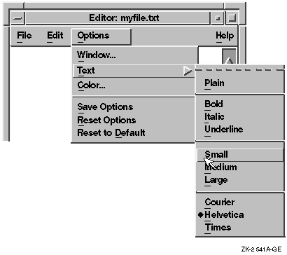
If you supply a few choices, consider having one submenu that allows
users to customize the font family, point size, and rendition, as in
Figure 3-4.
Figure 3-4 Using One Menu to Customize Text
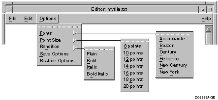
If there are more than a few choices and if users will not be
customizing text often, consider having a series of submenus, as shown
in Figure 3-5.
Figure 3-5 Using Several Menus to Customize Text
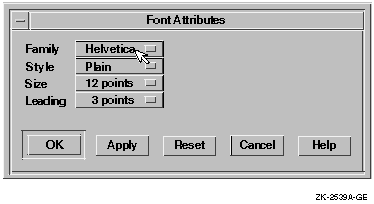
If users will be customizing text often, consider combining choices of
font family, point size, and rendition into one dialog box to avoid
making users pull down a series of menus to accomplish one task. For
example, create a dialog box similar to the one in Figure 3-6.
Figure 3-6 Using a Dialog Box to Customize Text
Chapter 4
Using Color
This chapter discusses the following topics concerning color:
- Why use color?
- General guidelines and specific recommendations
- Digital's Color Mixing widget
4.1 Why Use Color?
The primary reason for using color is to help users. Color can help
users accomplish their tasks by:
- Making important things stand out
For example, in a
spreadsheet, display all negative numbers, or the cells containing
these numbers, in red.
- Showing relationships among objects
Use color to group related
items. Displaying related objects in the same color can be especially
useful in densely packed displays. For example, on a spreadsheet, group
all income from one source in one color, and all income from another
source in another color.
- Allowing users to see differences quickly and consistently
The eye is attracted to color over every other feature on an
interface (except flashing). Thus, use color for important things such
as error messages because users' eyes will be attracted quickly to the
color.
- Indicating keyboard focus
For example, in a Motif environment, users can have many windows open
at one time. Using a specific color border to indicate input focus
helps users locate the window with keyboard focus quickly and
consistently.
- Corresponding with conventions used in certain professions
For example, if your application helps people design objects such as
maps or buildings, it is important to keep color connotations
consistent between the traditional colors used on paper renderings and
those appearing on line. For example, mapmakers might expect to see
blue water in the maps they design with a survey application.
4.2 General Guidelines and Specific Recommendations
Remember that the purpose of using color is to help users accomplish
tasks. Color is not always needed and may not be available. Never give
your application color-specific features that disappear in a black and
white interface. For these reasons, always design the interface for
black and white (monochrome) displays first. The following list shows a
few reasons to design in black and white first:
- Some people are colorblind.
- Your application might run on both color and monochrome displays.
- Color printers are uncommon and expensive; many users may be
printing on black and white printers.
4.2.1 Before You Select Colors
Before you select colors for your application, consider the following:
- The visual abilities and disabilities of the users
- The color preferences of the users (in terms of nationality,
culture, background, previous experience, and so on)
- The physical environment in which users use the computer (including
the country, company, and specific work environment)
- The areas where you want to focus the users' attention
- The assignment of colors in related applications
4.2.2 After You Select the Colors
After you have selected some colors to work with, keep the following
guidelines in mind:
- Limit the number of colors.
- Use color as a redundant cue. Make sure that users can identify an
object by its shape or intensity in addition to its color. For example,
stop signs in the U.S. and many parts of Europe are identified by their
red color and octagonal shape.
- Use color sparingly. Never vary the color just for variety. Try to
use only four or fewer colors in one window, and try to use only seven
or fewer colors in an entire application. Research has shown that users
have trouble distinguishing among more than seven colors in a user
interface.
-
Minimize the use of bright, saturated colors. Limit them to items that
must be noticed. If you overuse these colors, the attention-getting
properties will be lost.
- Use white, black, or shades of grey for objects (like text) that
users will view for a long time.
- Do not depend on subtle changes in color to convey important
information. Users may not notice the change.
- Have a purpose for each color
-
Reserve red for warnings and negative numbers (at least in European and
American displays, where red connotes danger). Because it is the most
noticeable color, use it with care and use an unsaturated red color.
The full red color may be too jarring for users.
-
Provide a color key so that users can compare colors if you use a color
code as a primary coding mechanism.
- Use color codes only under the following circumstances:
- When users are already familiar with a color code
- When you must catch the users' attention
- When users must search for categories of information
- When related applications use a color code
- Do not use the same color to represent two different meanings.
- Use existing conventions for color codes whenever possible, such
as red for deficits and black for profits in business applications.
- Make sure that the colors you use do not conflict with color
connotations in other countries, if your application will be used in
those countries. Or allow users to customize their colors.
- Be careful about what colors you use together.
- Do not use color coding for displays located in the periphery of
the screen. Color receptors are located mainly in the focus point of
the eye; thus, users may have difficulty perceiving colors located on
the periphery.
- Make adjacent colors differ in at least two of the three primary
colors (red, green, blue), so that color-weak users will be more likely
to distinguish the differences.
- Do not require users to distinguish between green and red without
other cues; green-red color confusion is the most common type of color
weakness.
- Be aware of the colors surrounding colored targets. Avoid
situations where the simultaneous contrast effect could allow users to
misinterpret information. For example, a yellow symbol will appear
greener when surrounded by red, and redder when surrounded by green.
- Display bright colors on dim backgrounds, or dim colors on bright
backgrounds. This maximizes the contrast.
-
Do not use blue for characters, lines, or edges, unless your intent is
to make the object look indistinct and fade into the background. Blue
is difficult to see. If used for edges or text, these items will appear
fuzzy and blurred.
- Do not use saturated red and blue in adjacent areas; these colors
induce a disturbing depth effect.
- Do not use saturated red and green in adjacent areas. These colors
can induce a disturbing spurious motion effect.
For more
information about using color, see the list of references in
Appendix C.
Specific Recommendations
Here are some specific recommendations to follow concerning color in
dialog boxes, menus, and pointers.
- Dialog Boxes
Arrange and design dialog boxes for monochrome displays. There is
probably no reason to use color for the objects in a dialog box, unless
it is a dialog box for selecting colors, as in a drawing or painting
program.
- Menus
Design menus, like dialog boxes, for a monochrome display. The primary
instance in which you need to use color in menus is when you create a
menu for choosing colors. There are a few other cases when color can be
helpful in menus, for example, using red letters for a menu item
labeled "Important."
- Pointers
Make sure that the pointer is visible over all areas of the screen.
Using black with a white border is probably the safest choice, even
with color displays.
|