DECwindows Companion to the OSF/Motif Style
Guide
5.3.1.4 Additional Topics
The Additional topics portion of the Help window allows users to get
further help on the current Help topic or topics related to the current
topic. Involve users in testing to determine how many and what type of
additional topics are best.
To select and display an additional topic, users position the pointer
over the topic, click MB1, and then choose the Go To menu item from the
View menu. Users can also double click on the topic.
5.3.1.5 Push Buttons
The Help window includes two push buttons:
- Go Back, which displays the previous Help topic.
- Exit, which dismisses the current help display.
For more information on using the Help widget, see the DECwindows
Motif Guide to Application Programming and the DECwindows
Extensions to Motif.
5.3.2 Using the DECwindows Motif Help System
The DECwindows Motif Help System uses Bookreader to display the online
help file. Digital provides three routines for allowing users to access
online help files in Bookreader format. These routines are documented
in the DECwindows Motif Guide to Application Programming.
Users can invoke the DECwindows Motif Help System from the Help menu,
the Help command, the Help push button or the Help key.
The DECwindows Motif Help System includes the following features:
- Proportional fonts, which are more legible than fixed fonts
- Graphics
- Formatted tables
- Hotspots (A way to move around in the help text by clicking on
parts of the text)
- A means to create LinkWorks links between the online help and other
pieces of information, such as mail messages and other Bookreader topics
For more information on Bookreader, see the DECwindows Motif Guide
to Application Programming.
You can use any of the following tools to create DECwindows Motif Help
System files:
- DECwrite
- VAX DOCUMENT (OpenVMS for VAX only)
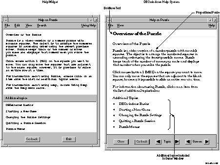
Table 5-1 compares the features of the Help Widget to the features
of the DECwindows Motif Help System, and Figure 5-9 shows some of
the differences in the Help windows.
Table 5-1 Comparison of Help Widget and DECwindows Motif Help System Features
| Feature |
Help Widget |
DECwindows Motif Help System |
|
Text
|
Small, monospaced font
|
Multiple fonts, including italics and boldface and multiple point sizes
|
|
Performance
|
Adequate for large help libraries
|
Better for large help libraries
|
|
Graphics
|
No support
|
FSE binary file format for graphics
|
|
Navigation
|
Additional topics list
|
Hotspots
|
|
Tables
|
No support
|
Supported
|
Figure 5-9 Comparison of Help Widget and DECwindows Motif Help
System Windows
Chapter 6
Using Digital-Specific Widgets
This chapter describes design and style considerations for the
additional widgets that Digital provides with its offering of Motif, or
that Digital sells as layered products. The additional widgets that
Digital provides with its offering of Motif are the following:
- Color Mixing
This widget is described in Chapter 4.
- Help
This widget is described in Chapter 5.
- Print
This widget is described in this chapter.
- Structured Visual Navigation (SVN)
This widget is described in
this chapter.
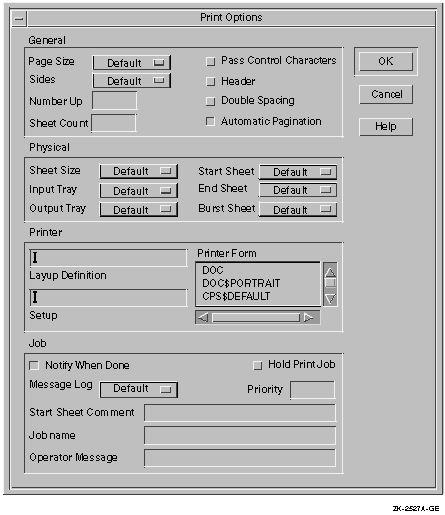
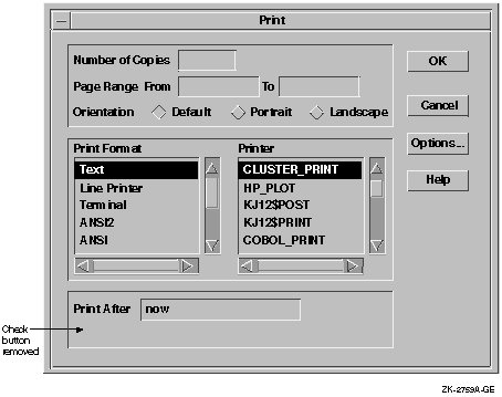
6.1 Using Digital's Print Widget
You can use Digital's Print widget in any application that allows users
to print files on OpenVMS, UNIX, or Windows NT systems. It consists of
a primary dialog box (as shown in Figure 6-1) and a secondary dialog
box that is invoked by pressing the Options... push button. The
secondary dialog box varies depending upon the operating system;
Figure 6-2 shows the secondary dialog box on OpenVMS systems.
Figure 6-1 Print Widget's Primary Dialog Box
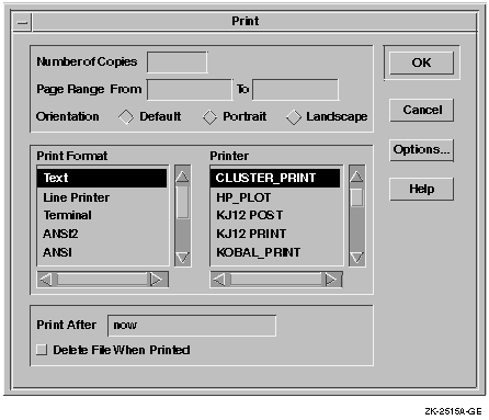
Figure 6-2 Print Widget's Secondary Dialog Box on OpenVMS
Systems
In the primary Print dialog box, users can change any of the following
settings:
- Number of copies
- Page range
- Orientation
- Print format
- Printer
- Time after which the file prints
- Whether to delete the file after it is printed
The secondary dialog box varies greatly depending on the operating
system on which it is being used.
Customizing the Print Widget
You can customize the Print widget dialog boxes to meet the printing
needs of your application. For example, in some applications the Delete
File When Printed check button is not appropriate. The Print widget
allows you to erase such tab groups easily so that they do not appear
in the dialog box, as shown in Figure 6-3.
Figure 6-3 Erasing Tab Groups Users Do Not Need
Because the Print widget does not provide a mechanism for allowing
users to save their print settings, provide a way for them to do so.
For example, have the Save Options menu item from the Options menu
automatically save print settings, or add a Save Print Options menu
item to the Options menu.
For more information about the Print widget, see the DECwindows
Motif Guide to Application Programming and the DECwindows
Extensions to Motif.
6.2 Using the Structured Visual Navigation Widget
You can use the Structured Visual Navigation (SVN) widget to create
hierarchies of information in an application; it allows users to access
and restructure information in a hierarchical way. You can think of SVN
as being able to display levels of information. Users can have it
display only the top level of information, or they can expand that
level to display the information under the top level.
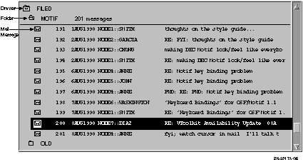
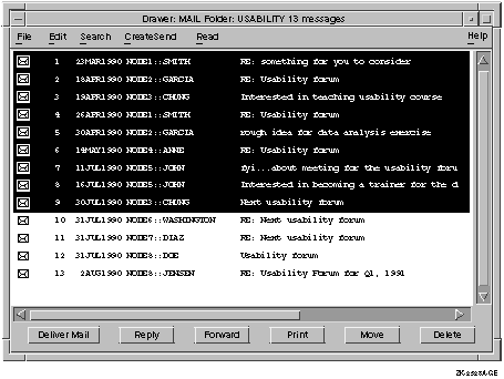
For example, in OpenVMS DECwindows Mail, users can create drawers that
contain folders, and folders that contain messages. In displaying this
hierarchy, they can show just the drawers (the highest level of
information hierarchy), they can "open" a drawer to display
all the folders within it, and "open" a folder to display all
the mail messages in the folder, as shown in Figure 6-4.
Figure 6-4 Using the Outline Format to Show SVN
Hierarchy
 You can use SVN to allow users to display hierarchical information in
three different formats, or modes:
You can use SVN to allow users to display hierarchical information in
three different formats, or modes:
- Outline format, shown in Figure 6-4
- Tree format, shown in Figure 6-5
- Column format, shown in Figure 6-6.
The difference between the outline and the column format is that in
column format, a window pane separates a set of components from the
rest of the display. Users can scroll horizontally on each side,
independently of the other side. However, there is only one vertical
scroll bar.
Figure 6-5 SVN Tree Format
Figure 6-6 SVN Column Format
In addition to the three formats, SVN has other features that you can
use to create an interface that helps users navigate through
hierarchical information. For example, SVN allows you to create outer
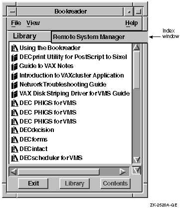
arrows on a scroll bar (shown in Figure 6-6), and an index window
(shown in Figure 6-7).
Outer arrows perform operations that are a magnitude greater than the
stepper (inner) arrows. Clicking on the upper stepper arrow moves the
display up one unit. Clicking on the upper outer arrow moves the
display to the top of the level of hierarchy that users are currently
seeing. For example, if a screen displays messages 20 through 40 in a
folder that contains 200 mail messages, clicking on the upper outer
arrow would cause messages 1 to 20 to be displayed; clicking on the
lower outer arrow would cause messages 180 to 200 to be displayed.
The index window is a special window, attached to the scroll bar that
offers a guide to the material to be displayed in the window when users
release the mouse button. In Figure 6-7, you can see an index window
displaying book titles from a Bookreader library. In addition, SVN
provides live scrolling, sometimes called smooth
scrolling.
When you enable live scrolling, the display changes dynamically when
you move the slider; without live scrolling, when you move the slider
on the scroll bar, the display does not move until after you move the
slider.
Figure 6-7 SVN Index Window
6.2.1 Determining the Components of an Entry
Each SVN entry, or line, in your hierarchy may display as many as 30
components of information. Each component is one of three types:
- Text
- Pixmap (for example, an icon)
- Widget (for example, a push button)
Figure 6-8 illustrates SVN entries using pixmaps (icons) and text.
Figure 6-8 Components in an SVN Entry
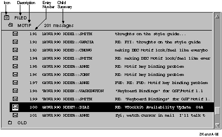
The highlighted entry (near the bottom of the illustration) has four
components:
- A pixmap (An envelope icon that depicts a mail message)
- Text (A text string showing the mail message number)
- Text (Another text string, which is a short line of text that
describes whom the mail message is from)
- Text (Yet another text string, which shows the subject line of a
mail message)
6.2.2 Designing the Appearance of Your Hierarchy
The appearance of the hierarchy greatly influences users' ability to
grasp the information it contains. A hierarchy that displays entries in
an organized manner is more likely to be understood than one that does
not. The following elements help to create a well organized hierarchy:
- The states of icons
- The entry level spacing, that is, the way the entries are indented
to show a lower level of hierarchy
- The number and type of fonts used
- The type of selection line presented
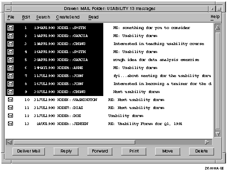
6.2.2.1 Showing Icon States
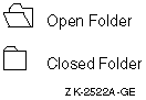
The icon must be able to represent either the expanded or collapsed
state of the entry. An expanded entry displays the entries in the level
below it. A collapsed entry does not. For example, the folder icon in
OpenVMS DECwindows Mail can show a closed folder for an unexpanded
entry, or an open folder for an expanded entry, as shown in
Figure 6-9.
Figure 6-9 Expanded and Collapsed SVN Icon States
6.2.2.2 Aligning Entries
Align the children of an entry along a common line. This gives the
hierarchy an even, ordered appearance and enables users to distinguish
one level of hierarchy from another. For example, the hierarchy of mail
messages to folders to drawers is clear because mail messages are
indented under folders, and folders are indented under drawers, as
shown in Figure 6-4.
6.2.2.3 Using Fonts Within a Hierarchy
The size and type of font style you use throughout your SVN hierarchy
will determine how quickly and efficiently users perceive information.
Although this choice is highly subjective, there are a few guidelines
to follow when you design the appearance of the hierarchy.
- Limit the Number of Fonts
Limit the number of different fonts
and font sizes contained within a hierarchy. Use one font and one font
size throughout the entire hierarchy, while altering the style of the
font on different levels within the hierarchy.
For example, use 14
point Helvetica with bold letters for the parent entries on one level
of the hierarchy and 14 point Helvetica with plain letters for their
children. This enables users to distinguish between the parent and
child entries.
Displays that contain many different fonts, font
styles, and font sizes are confusing to users because they constantly
draw their eyes from one element to another.
- Choose a Simple Font
Choose a font that is easy to read on the
screen. A commonly used style like Helvetica is a good choice because
the characters are simple and clear. Be sure the characters are large
enough to be seen. Characters displayed on a screen need to be larger
than those in print to be clear. A good character size is 14 points.
Avoid using characters that are smaller than 12 points.
- Using Additional Fonts and Font Sizes
Some applications may
require you to use several fonts or sizes of fonts to present your
material clearly. If this is the case, organize your entries carefully,
using the same type of font and font size for all entries on the same
level of hierarchy. Preliminary tests indicate users prefer a gradient
scale of font sizes, with the larger sizes at the top of the hierarchy
and the smaller ones at the bottom.
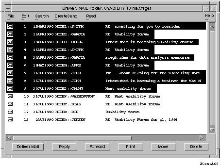
6.2.2.4 Choosing Selection Modes
There are two selection modes in SVN: full and limited selection. In
full selection line mode, when users select any component in an entry
line, the entire entry is selected; that is, every component of the
entry is automatically selected. An example of full selection is shown
in Figure 6-10.
Figure 6-10 SVN Selection with a Full Selection Line
In limited selection line mode, users can select individual components
within the entry, as shown in Figure 6-11. SVN does not support both
selection modes within one application, so choose the selection mode
that best suits the users' needs.
Figure 6-11 SVN Selection with a Limited Selection Line
6.2.2.5 Choosing Selection Line Length
Within each selection mode are two selection line lengths that you can
choose: fixed and variable. With a fixed-length selection line, the
entire length of the entry appears selected, as shown in Figure 6-10.
However, with a variable-length selection line, only the part of the
component field that displays user information appears selected, as
shown in Figure 6-12.
Figure 6-12 SVN with a Variable-Length Selection Line
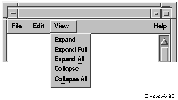
6.2.3 Providing Items in the View Menu
When you use SVN in any window except a dialog box, allow users to
quickly expand and collapse multiple entries by providing the following
items in the View menu:
- Expand
Expands the currently selected item one level
deeper.
- Expand Full
Expands the selected items to their full
depth.
- Expand All
Expands all items to their full depth.
- Collapse
Contracts the selected items.
- Collapse All
Contracts all items.
Figure 6-13 shows an example arrangement of these items in the View
menu.
Figure 6-13 SVN Menu Items in the View Menu
 For more information on creating interfaces with SVN, see the
DECwindows Motif Guide to Application Programming and the
DECwindows Extensions to Motif.
For more information on creating interfaces with SVN, see the
DECwindows Motif Guide to Application Programming and the
DECwindows Extensions to Motif.
Chapter 7
Working with LinkWorks
This chapter describes LinkWorks and discusses user interface issues
related to creating a hyperapplication (an application that
participates in a LinkWorks environment). For more information on
hyperapplication design and implementation, see the LinkWorks
Developer's Guide. Note that LinksWorks is available on OpenVMS
and Digital UNIX systems, but not on Windows NT systems.
7.1 What Is LinkWorks?
LinkWorks provides the ability to link related pieces of information,
regardless of where this information is stored. Providing LinkWorks
support in your application involves using a set of routines. You
include calls to these routines to enable users of your application to
make and follow links between pieces of information in your own
application and in other applications that provide LinkWorks support.
When your application includes calls to these routines, it can be
called a hyperapplication.
For example, users who have made a link between a Mail message and a
Calendar time slot can move directly from the time slot to the Mail
message using LinkWorks.
Many applications provide LinkWorks support; your application may be a
candidate for becoming part of the hyperinformation environment. If so,
the essential tasks for you as an application developer are as follows:
- Identify linkable objects.
- Add the LinkWorks User Interface.
- Provide user interface callback routines.
- Register your linkable object types with LinkWorks during the
installation of the application on a system.
LinkWorks is analogous to an online clipboard. Some of the similarities
include the following:
- Both are used across a variety of applications.
- Both facilitate the integration of different applications without
the applications knowing about each other.
- Both focus on interapplication activities rather than
intra-application ones; however, both also permit intra-application
activities.
An important difference between LinkWorks and a
clipboard is that the purpose of LinkWorks is to create and follow
links between information, while the purpose of the clipboard is to
move data between applications.
- Both use a standard application menu as the access mechanism.
7.2 Deciding What to Support as Linkable Objects
As an application developer, you must decide what objects in your
application you will support as linkable objects. That is, you must
decide what types of information users will want to have connected. It
is possible for every object in your application to be a linkable
object, but this may not be feasible, nor is it necessarily helpful for
the users. Allow only the most important application objects to be
linkable.
Use the following questions to help guide your choice of linkable
objects:
- What is the primary purpose of your application?
- What is the primary information that your application handles?
- How will users use your application to accomplish their tasks?
- How will links to and from your information help users to
accomplish their tasks?
For example, Bookreader includes the following information as LinkWorks
linkable objects:
- A bookshelf
- A book
- A topic
- A table
- A figure
When you are deciding what objects to support as linkable objects,
remember that users may be making links both within your application
and between your application and other applications.
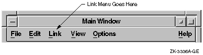
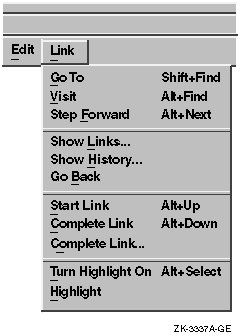
7.3 Adding the Link Menu
To let users know that an application has LinkWorks support, add the
Link menu in the menu bar of each window that can display a linkable
object, as shown in Figure 7-1.
When you purchase the LinkWorks Developer's Tools, you receive the
LinkWorks Services. These services provide the Link menu and associated
dialog boxes. All you need to do is place this menu to the immediate
right of Edit in the menu bar. If there is no Edit menu, place the Link
menu to the right of the File menu and to the left of the View or
Options menus.
Figure 7-1 Link Menu
7.3.1 Standard Link Menu
The standard Link menu allows users to follow established links and
create new ones. Figure 7-2 shows that the LinkWorks menu is divided
into sections that do the following:
- Follow links and paths
- Show links and navigation history
- Create new links
- Highlight linked information
Figure 7-2 LinkWorks Menu Items
7.3.2 Customizing the Link Menu
There are two ways that you might consider customizing the Link menu:
- Augment the operations that the given menu items perform, and
instead have those menu items invoke your own application-specific
operations. Be aware that if you choose to do this, you may confuse
users who are accustomed to using these menu items in other
applications.
- Provide additional items in the LinkWorks menu that add new
functions. If you choose to do this, try to follow the guidelines for
creating menus discussed in Chapter 2.
7.4 Using Highlighting Techniques
Users can request that linked objects be explicitly identified
(highlighted) in your application displays. It is up to you to
determine the most effective techniques for highlighting these linkable
objects. Base the technique you use on the type of information being
displayed.
7.4.1 Guidelines for Highlighting
The following are suggested guidelines for using highlighting. If you
must violate these guidelines, try to minimize any disruptive impact.
|