 |
DECwindows Companion to the OSF/Motif Style
Guide
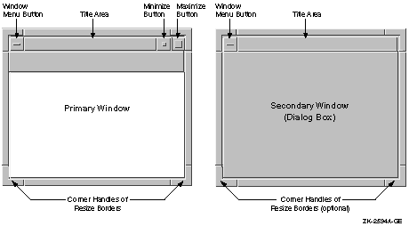
1.2 Using Window Decorations
The window manager provides several decorations to any window. All
windows receive the following decorations automatically:
- Resize borders. Notice that the corner handles on the border resize
the window in both x-coordinate and y-coordinate, while the side
borders resize the window only along one coordinate.
- A window menu button. Pressing the window menu button causes the
window menu to appear. The window menu typically contains items for
restoring, moving, sizing, minimizing, maximizing, lowering, and
closing the window.
- A title area
- A minimize button. Pressing the minimize button shrinks the window
into an icon.
- A maximize button. Pressing the maximize button makes the window
as large as it can be.
Give dialog boxes only the following decorations:
- A window menu button
- A title area
- Resize borders (optional) See Section 1.2.2.
These decorations are the default. Figure 1-8 compares the window
decorations for primary windows to the decorations for secondary
windows.
Figure 1-8 Window Decorations on Primary and Secondary
Windows
1.2.1 Titles in Dialog Boxes
Give each dialog box a title. The elements of a title are as follows:
- The application name (followed by a colon)
- A space
- The name of the menu item or push button from which it was invoked
See Figure 1-9 for examples of titles.
In some cases you may want to include a menu name with the menu item.
For example, if users pull down the Options menu and select the General
menu item, give the associated dialog box the following title:
In this example, Mail is the name of the application, General is the
name of the menu item, and Options is the name of the menu.
Figure 1-9 Appropriate and Inappropriate Titles in Dialog
Boxes
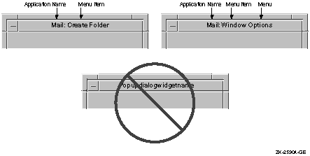
Figure 1-9 also shows an example of a dialog box title that is
inappropriate because it is the name of the widget. A widget name means
nothing to users, so do not use one as the title of a dialog box.
Programming
Hint
Use the XmNdialogTitle resource to set the title of a dialog box.
|
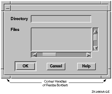
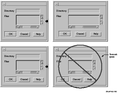
1.2.2 Resizing Dialog Boxes
Use the following guidelines to determine when to include resize
borders on your dialog box:
- When your dialog box contains text-entry fields, list boxes, or
other controls that are not always a fixed size, provide resize
borders. The dialog box in Figure 1-10 has resize borders to allow
users to see entire file names and to see everything they type in the
text-entry field.
- When your dialog box contains only fixed-size controls (such as
push buttons, check buttons, and radio buttons), make the dialog box
big enough to display all the components. That is, design your boxes so
users do not need to resize the box, and then do not include resize
borders.
Programming
Hint
To create a dialog box without resize borders, set XmNnoResize=True.
To create a dialog box with resize borders, set XmNnoResize=False. This
resource is inherited from XmBulletinBoard.
|
Figure 1-10 Use Resize Borders with Text-Entry Fields or List
Boxes
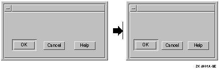
If you provide resize borders, here are a few guidelines to follow:
- When users make the dialog box smaller, do the following:
- Set a minimum size for the dialog box. That is, do not allow users
to make the dialog box so small that it is no longer useful. Users
should be able to see all of the controls, and activate the push
buttons when the dialog box is at the minimum size.
- Move the controls closer together so that they can still be seen
and activated. See Figure 1-11 for an example.
Figure 1-11 Move Push Buttons Closer Together
Programming
Hint
Digital provides a routine (DXmFormSpaceButtonsEqually) that helps to
move push buttons closer together. For more information, see
Section 1.3.
Use the following code as an example of how to set a minimum size for
your dialog box. In the following example, the minimum size is 100; you
need to determine an acceptable minimum size for your dialog box:
Arg arglist[2];
XtSetArg(arglist[0], XmNminWidth,  100);
XtSetArg(arglist[1], XmNminHeight, 100);
XtSetValues(XtParent(dialog_box), arglist, 2);
|
|
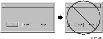
- Do not truncate the information that was in the box, as shown in
Figure 1-12. When the dialog box is truncated, important push buttons
or other controls may disappear.
Figure 1-12 Do Not Truncate Push Buttons
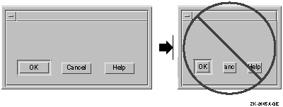
- Do not truncate the labels in the push buttons, as shown in
Figure 1-13. Users cannot read the labels and might not know which
push buttons to activate.
Figure 1-13 Do Not Truncate Labels in Push Buttons
- Do not overlap the push buttons in a minimized dialog box, as shown
in Figure 1-14. It is difficult for users to tell where to click in
order to activate which button.
Figure 1-14 Do Not Overlap Push Buttons

- When users increase the size of a dialog box, have the size and
layout of the dialog box increase proportionally. Do not add blank
space to the area of the dialog box that is larger, as shown in
Figure 1-15.
Programming
Hint
To increase the size and layout of controls within a dialog box, use an
XmForm widget or an XmFormDialog widget and specify both left and right
attachments for each control that needs to expand and contract. Use
DXmFormSpaceButtonsEqually to make the push buttons expand and contract
properly.
|
Figure 1-15 Increase Size and Layout of Dialog Box
Proportionally
1.3 Creating Push Buttons
This section contains guidelines and programming hints to help you
create and arrange push buttons for dialog boxes.
1.3.1 Default Push Button
Give every dialog box a default push button.
The default push button allows users to continue working by pressing
the Return key (thereby activating the default push button). When you
indicate the default push button, Motif automatically gives it extra
highlighting as shown in Figure 1-16.
Programming
Hint
To enable the default push button, set XmNdefaultButton to the name of
your default button widget in the UIL file. To enable F11 (the Escape
key) as the Cancel key, set XmNcancelButton
to the name of the cancel button widget in the UIL file.
|
1.3.2 Cancel Button
Give a dialog box a Cancel push button only when appropriate.
Programming
Hint
To enable F11 (the Escape key) as the Cancel key, set XmNcancelButton
to the name of the cancel button widget in the UIL file.
|
1.3.3 Labels in Push Buttons
Center labels in push buttons, as shown in Figure 1-16. Centering
occurs by default, so do not override it.
When using the standard push buttons in a dialog box, try to preserve
one of the following orders:
- OK Apply Reset Default Cancel Help
- OK Cancel Options... Help
- Yes No Cancel Help
The OK button should always be the first button; the Help button should
always be last. The Cancel button should be the next to the last
button, with one exception. If there is an Options... button or another
button that brings up another dialog box, you should place that button
between the Cancel and Help buttons.
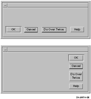
1.3.4 Push-Button Arrangement
Arrange push buttons horizontally across the bottom of the dialog box
(as shown in Figure 1-16) or vertically near the top right corner of
the box (as shown in Figure 1-17).
1.3.4.1 Horizontal Push-Button Arrangement
Two methods are recommended for arranging buttons horizontally:
- Space the buttons equally across the entire dialog box.
- Center the buttons together in the dialog box.
If the dialog box is narrow or there are many buttons, either method
works well. However, if the dialog box is wide or if there are few
buttons, you should center all the buttons, leaving equal left and
right margins. This arrangement minimizes the mouse movement necessary
to move between the buttons.
In the first method, you leave equal amounts of space between the
buttons and the margins. That is, you make the space from the left
margin to the first button equal to the space between each of the
buttons as well as the space between the last button and the right
margin. Figure 1-16 shows equally spaced push buttons at the bottom of
a dialog box.
Figure 1-16 Equally Spaced Push Buttons at the Bottom of a
Dialog Box
Programming
Hint
Digital supplies a routine, DXmFormSpaceButtonsEqually, that sets push
buttons in a form widget so they are equally spaced and sized. Use the
following code example to help you:
DXmFormSpaceButtonsEqually (parent, widget_list, num_widgets)

     Widget     my_form;
     Widget     *widget_list;
     Cardinal   num_widgets;
|
- The parent is the widget ID of the form widget containing the
buttons.
- The widget_list is an array of widget IDs of the buttons to be
changed.
- The num_widgets parameter is the number of widgets in the widget
list.
|
In the second method, to center the buttons, you use attachments to
attach the center button to a relative position in the dialog box.
Use the following Programming Hints for centering an odd number of
buttons or an even number of buttons.
Programming
Hint
This programming hint works for an odd number of buttons. The example
has five buttons: OK, Apply, Reset, Cancel, and Help.
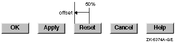
To center the buttons, first attach the left side of the Reset button
to 50% across the dialog box. Then set XmNleftOffset to be one half of
the size of the button:
        reset_args : arguments
            {
                XmNlabelString = "Reset";
                XmNwidth = 1500;
                XmNleftAttachment = XmATTACH_POSITION;
                XmNleftPosition = 50;
                XmNleftOffset = -750;     /* font units */
            };
|
If you are concerned about internationalization or font customization
by the user, you can modify the layout at run time. Follow these steps:
- Traverse all the buttons and calculate the size of the largest
button.
- Set all button widths to be the size of the largest button plus a
little space. This extra space ensures that the text does not run into
the border of the button. If the text for all of the buttons is short,
you should set the minimum size of the button approximately equal to
the Cancel button width.
- Set the XmNleftOffset of the middle button to half the size of the
buttons.
- Attach the other buttons to the left or right side of the Reset
button as is appropriate. You should leave an offset of about 200 font
units between each button:
        left_button_args : arguments
            {
                XmNwidth = 1500;
                XmNrightAttachment = XmATTACH_WIDGET;
                XmNrightOffset = 200;     /* font units */
            };

        right_button_args : arguments
            {
                XmNwidth = 1500;
                XmNleftAttachment = XmATTACH_WIDGET;
                XmNleftOffset = 200;     /* font units */
            };
|
See the Programming Hint for extra-long push buttons in Section 1.3.5 if
your buttons are not approximately the same size.
|
Programming
Hint
This programming hint works for an even number of buttons. The example
has four buttons: OK, Reset, Cancel, and Help.
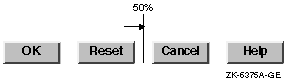
To center the buttons, first place the Reset button near the center,
attaching the right side of the button to 50% across the dialog box.
Then set XmNrightOffset to half the size of the space between the
buttons:
        reset_args : arguments
            {
                XmNlabelString = "Reset";
                XmNwidth = 1500;
                XmNrightAttachment = XmATTACH_POSITION
                XmNrightPosition = 50;
                XmNrightOffset = 100;     /* font units */
             };
|
If you are concerned about internationalization or font customization
by the user, you can modify the layout at run time. Follow these steps:
- Traverse all the buttons and calculate the size of the largest
button.
- Set all button widths to be the size of the largest button plus a
little space. This extra space ensures that the text does not run into
the border of the button. If the text for all of the buttons is short,
you should set the minimum size of the button approximately equal to
the Cancel button width.
- Attach the other buttons to the left or right side of the Reset
button as is appropriate. You should leave an offset of about 200 font
units between each button:
        left_button_args : arguments
            {
                XmNwidth = 1500;
                XmNrightAttachment = XmATTACH_WIDGET;
                XmNrightOffset = 200;     /* font units */
            };

        right_button_args : arguments
            {
                XmNwidth = 1500;
                XmNleftAttachment = XmATTACH_WIDGET;
                XmNleftOffset = 200;     /* font units */
            };
|
See the Programming Hint in Section 1.3.5 for extra-long push buttons if
your buttons are not approximately the same size.
|
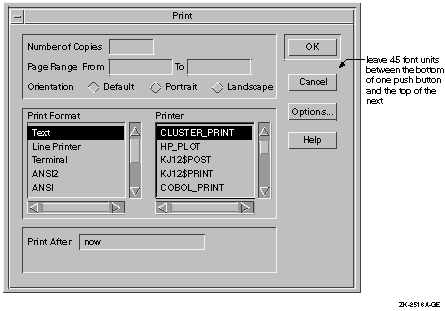
1.3.4.2 Vertical Push-Button Arrangement
If you arrange the push buttons vertically, place the default push
button in the top right position. Then align the other push buttons
under it. Leave a space of 45 font units of the default menu font
between the bottom of one push button and the top of the next.
Figure 1-17 shows a vertical arrangement of push buttons.
Figure 1-17 Vertically Arranged Push Buttons at the Side of a
Dialog Box
1.3.5 Push-Button Dimensions
Give all push buttons in your dialog box the same dimensions, even
though some labels might be longer than others.
However, if you have one label that is substantially longer than the
others, give the shorter labels smaller push buttons, providing all the
smaller buttons will have similar dimensions, as shown in Figure 1-18.
When the buttons are arranged horizontally, make the larger button
wider, but not taller, than the others. When the buttons are arranged
vertically, make the larger button taller, but not wider, than the
others. See Figure 1-18.
Programming
Hint
If your application will be internationalized, the extra-long push
button will be translated, and may no longer be the longest push button.
For international applications, put the resources for sizing and
positioning in UIL include files to simplify translation. For example,
if you are using a fixed size for your push buttons, define it in a UIL
include file and comment it thoroughly. You could define most buttons
with a literal named:
Define the long one with a literal named:
Then set their values as follows:
value
    normal_width = 50;
    long_width = 100; /* width of the long button*/
|
Reference these literals when defining the XmNwidth resources of the
buttons. At internationalization time, if the labels in the buttons
change width, change the value of the literals.
|
Figure 1-18 How to Handle a Push Button That Is Larger Than
Others
1.3.6 Help Push Button
Include a Help push button in all dialog boxes.
When users click on the Help push button, they should receive an
overview of the dialog box. You might also include additional topics
that provide detailed information on how to use each control within it.
(Some simple message boxes may not require a Help push button.) For
more information on designing online help, see Chapter 5.
If your application uses warning or error dialog boxes, provide a Help
push button in the dialog box if you cannot describe the error and
suggest a solution in one or two lines of text. Have the Help window
describe the error or warning displayed in the dialog box and provide a
suggestion for solving the problem.
1.4 Using Standard Message Dialog Boxes
Message dialog boxes provide users with information, such as error
messages, warnings, and the status of the application. Some ask
questions.
Like other dialog boxes, message boxes have a windows menu and a title
area. Each message box has an associated icon that identifies its
purpose.
When you create message dialog boxes, you should keep in mind the
following design considerations:
- Provide meaningful titles.
- Use complete sentences.
- Reuse the same message box to communicate the same message.
Titles for standard message dialog boxes consist of the following:
- The name of the application followed by a colon and then a space
- The message box operation or the type of message box
Specifying the operation in the title is recommended because the user
has more information about the context of the message box. For example,
you could use either of the following titles for a message box that
asks if you want to delete a mail folder, but the first one conveys
more information to the user:
Mail: Delete Folder

Mail: Question
|
You should use complete sentences or sentence-like wording in message
dialog boxes. Include the same punctuation as you would in a real
sentence. Keep the message concise so that it is quick and easy to
read. Do not, however, omit articles such as the or
a, or conjunctions such as and. When you create the
text, remember that it might need to be translated into other languages.
In general, you should avoid using system error codes in the message.
Instead, include descriptions of the actions users can perform. Place
any other information in the help text for that message box.
If you need more than one sentence in your dialog box, add a line of
white space before the final sentence or question. This space helps
users to focus quickly on what will happen when they press one of the
buttons.
Note that you should use the term Cancel, rather than Abort, in dialog
boxes.
When users perform the same action that has brought up a message box,
do not display a second message box. Instead, reuse the same message
box, but raise it to the top of the screen. Reusing the same box avoids
clutter caused by having many message boxes on the screen.
In general, you should not display a new dialog box for every message
in the application. Try to reuse one or a few of the same standard
message windows by replacing the text in them. If it is important for
the user to view previous messages, append new messages in a scrolled
window.
When creating DECwindows applications, use one or more of the five
standard message dialog boxes:
- Question (XmQuestionDialog)
- Error (XmErrorDialog)
- Information (XmInformationDialog)
- Warning (XmWarningDialog)
- Work in Progress (XmWorkingDialog)
|